Chhaya Jain
India
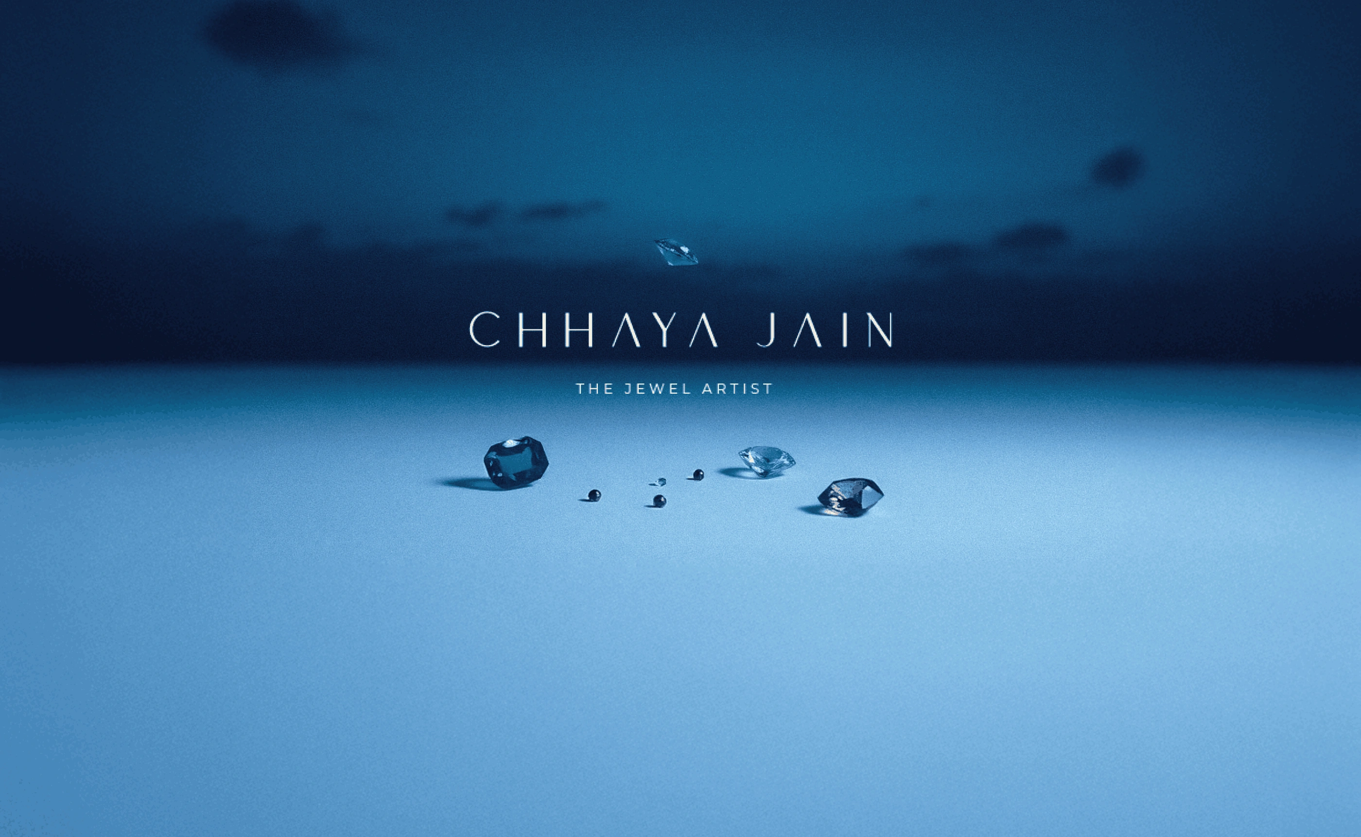
Where gemstones become poetry.
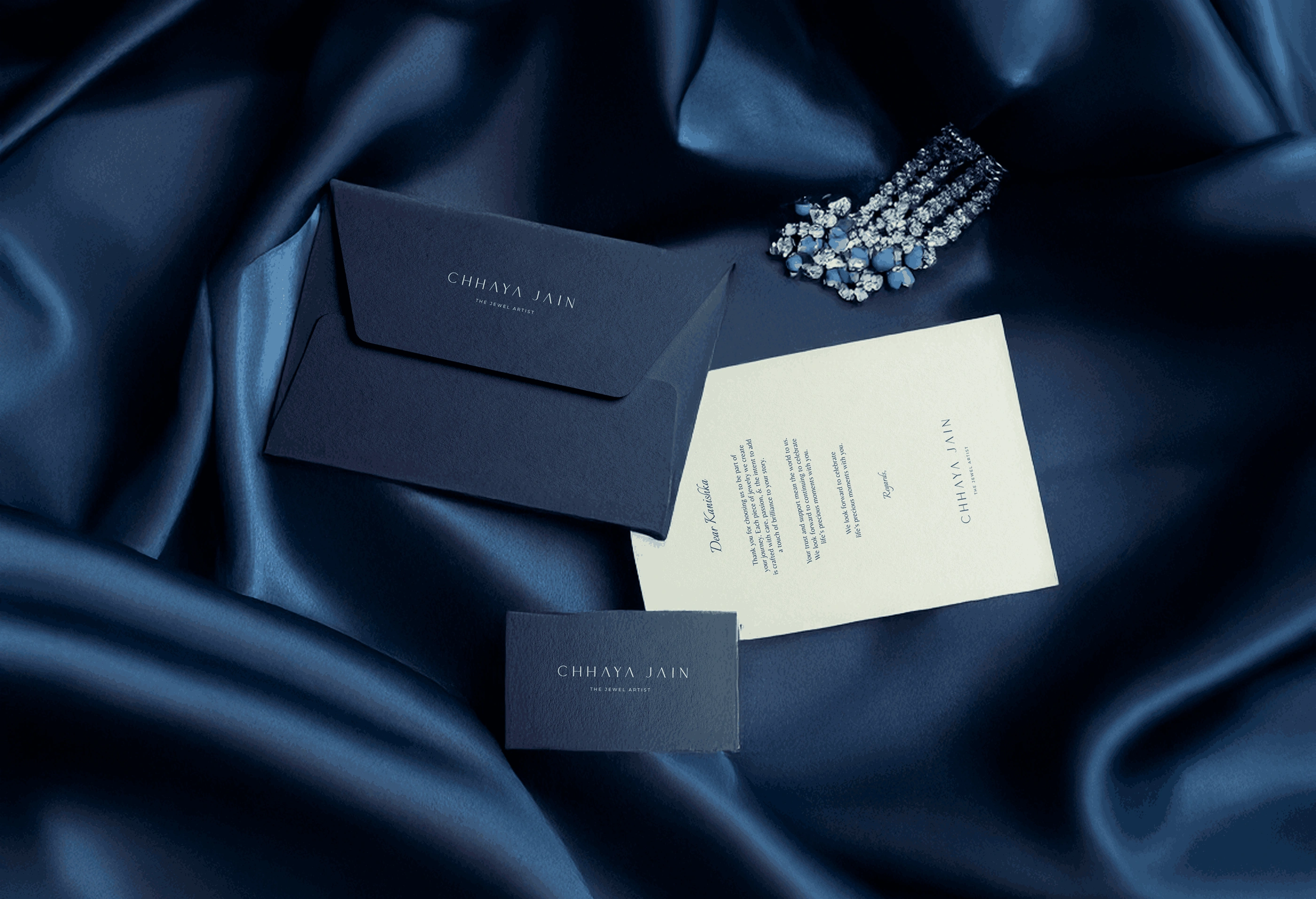
Chhaya Jain is a De Beers Award-winning jewellery artist who transforms precious stones into wearable narratives. Her work transcends traditional jewellery design, blending meticulous craftsmanship with artistic innovation that has earned recognition on international stages like IIJS Signature. We developed a brand identity that mirrors her design philosophy—where every element serves the stone's story, and restraint amplifies brilliance. The work positions Chhaya not as a jeweller but as an artist whose medium happens to be gemstones, capturing the delicate balance between her technical precision and creative vision.
BRAND IDENTITY
CHALLENGE
Framing brilliance without overshadowing it.
How do you brand a jewellery artist whose work already speaks volumes? The challenge was creating an identity strong enough to command attention in luxury markets while subtle enough to let the jewellery remain the star. We needed to differentiate Chhaya in a crowded field where most jewellers either lean on heritage or trend-driven aesthetics, positioning her unique blend of artistry and technical mastery. The brand had to appeal to collectors who value innovation and connoisseurs who appreciate craftsmanship, communicating both creative vision and precision engineering. We needed to translate the tactile experience of examining a stone under light into visual language that works across digital and physical touchpoints. Most critically, we had to capture what makes her award-winning—the ability to see possibility in raw gemstones and realize it through fearless design.


CREATIVE CONCEPT
Elegance through intentional absence.
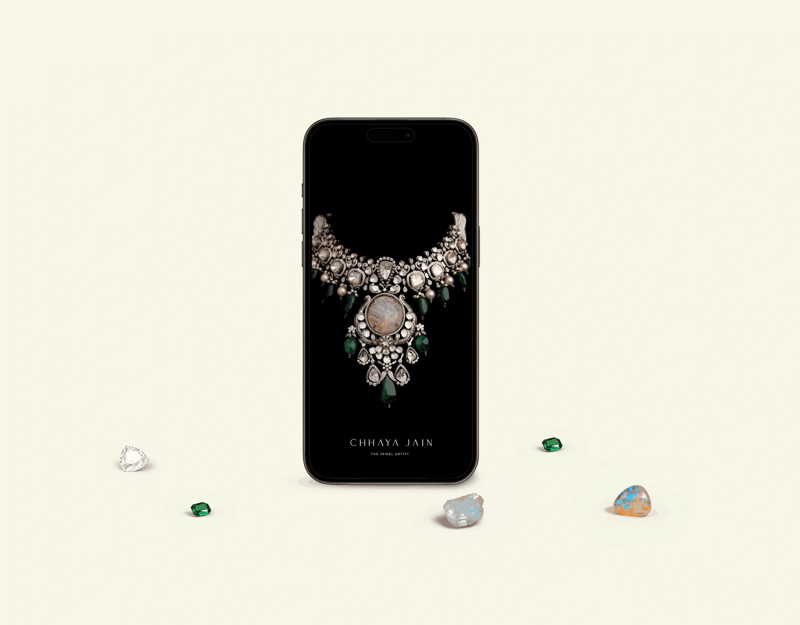
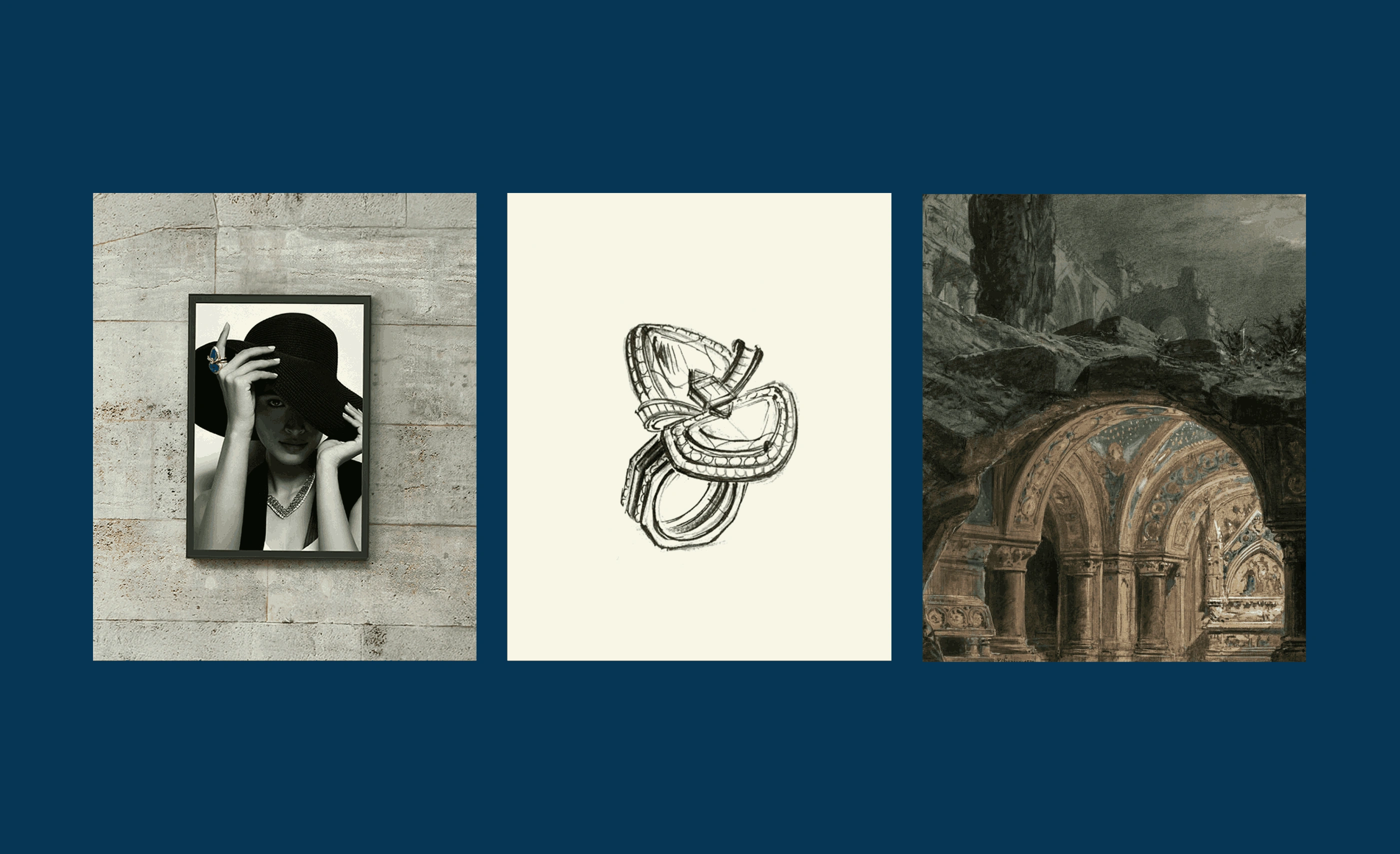
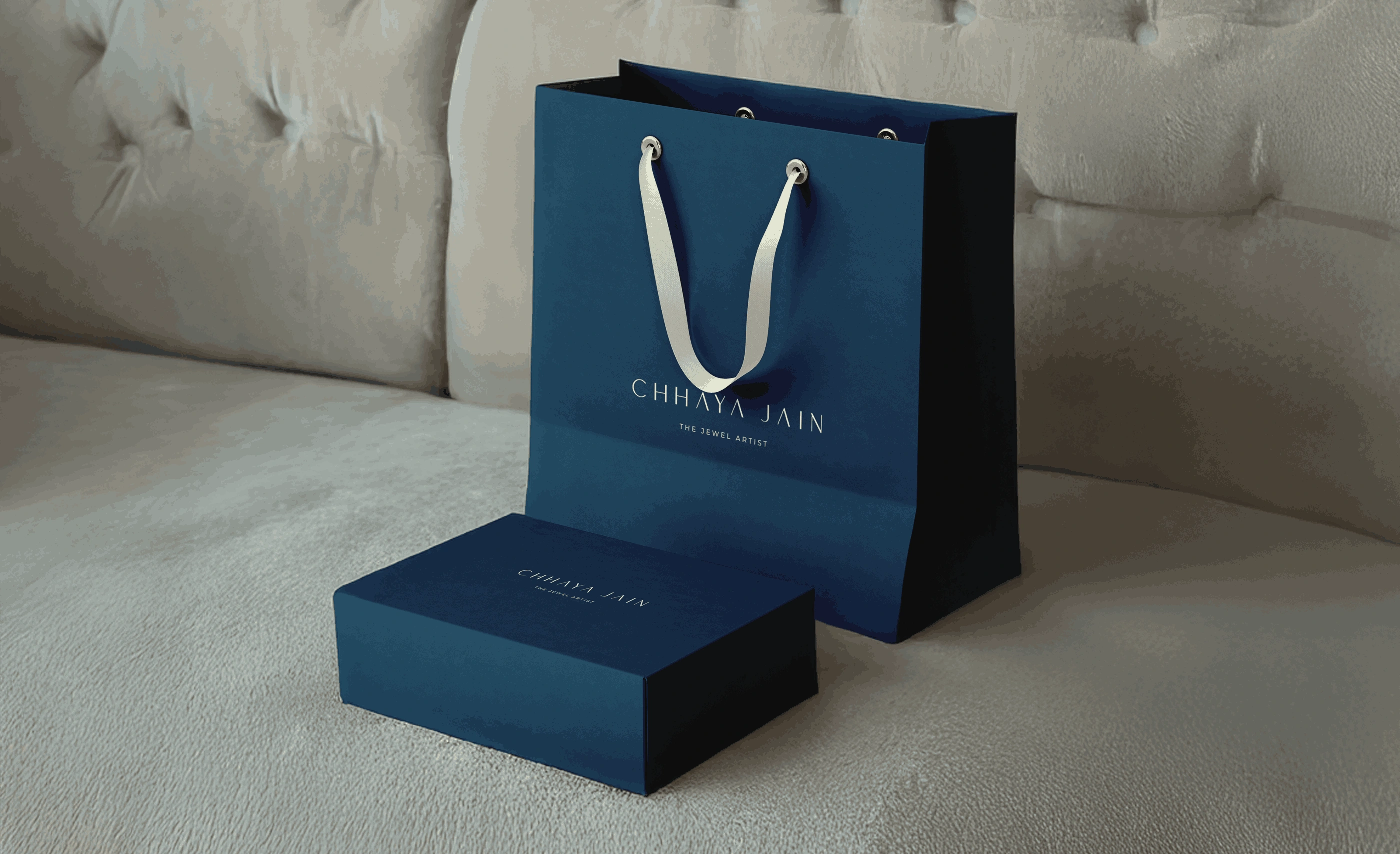
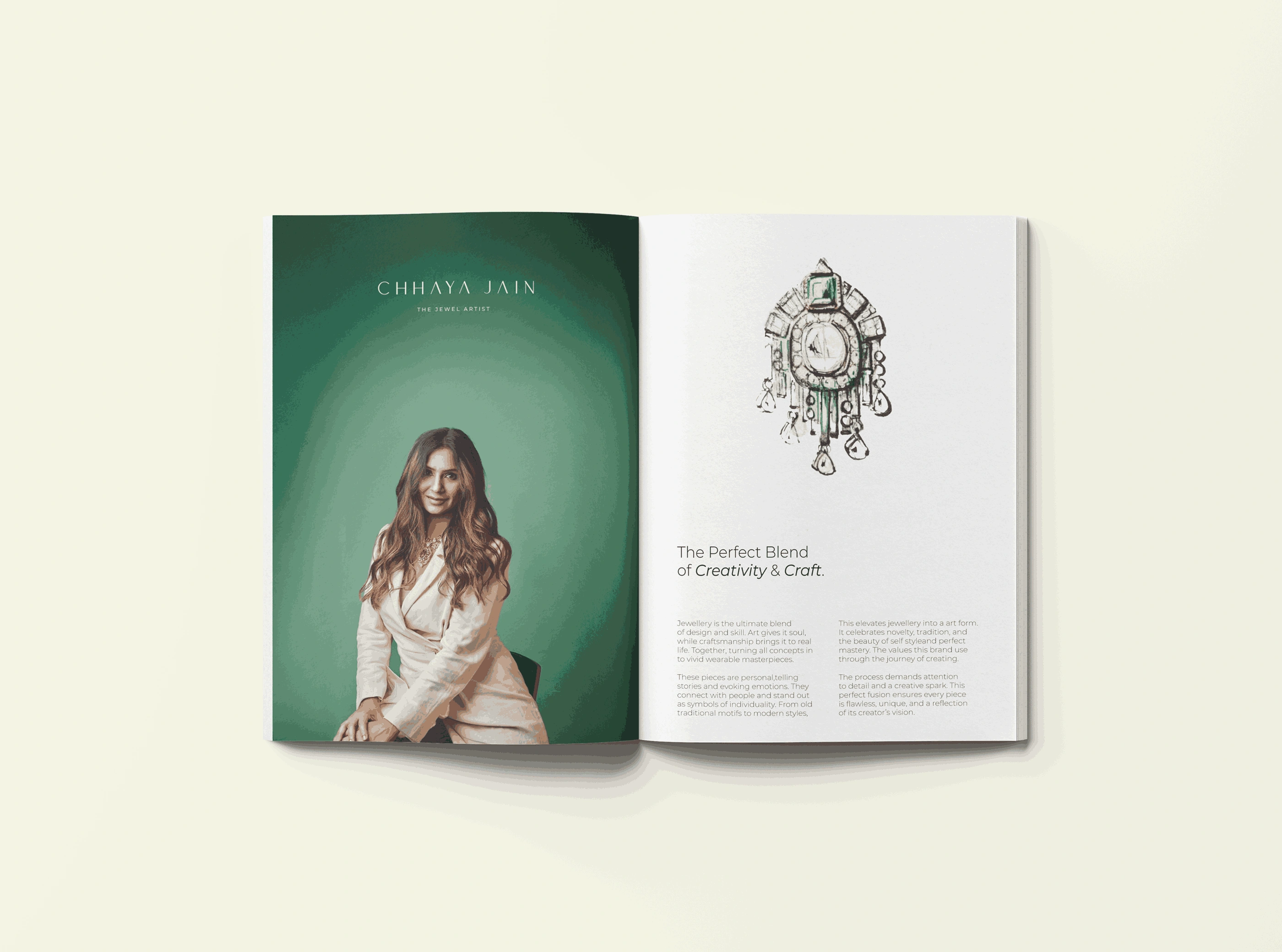
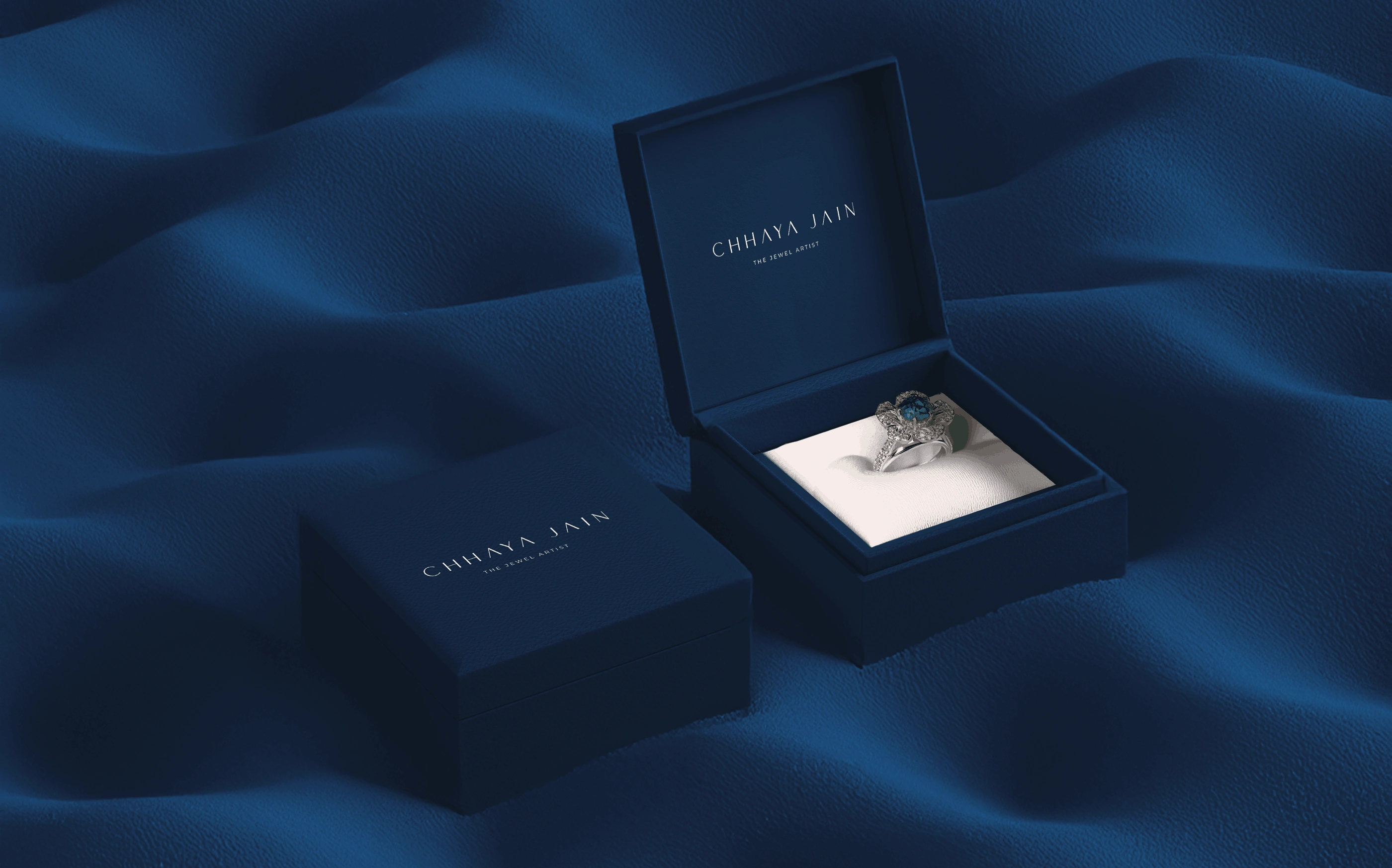
We positioned Chhaya Jain as "light, captured"—where design doesn't adorn gemstones but liberates them. The identity embraces minimalism as a strategic choice, using generous negative space to mirror how stones are displayed against dark velvet. Typography is refined and architectural, suggesting the structural precision behind each piece while maintaining fluidity. We developed a sophisticated monochromatic palette punctuated only by gemstone photography—letting color come exclusively from her work. The logo uses geometric abstraction inspired by faceted cuts, creating a mark that feels both technical and artistic. Photography style focuses on intimate details—the play of light through cut stones, the meeting of metal and gem, hands in the act of creation. Layout systems create breathing room around jewellery images, treating each piece as a gallery exhibit rather than product catalog. Printed materials use premium finishes that echo luxury without competing with the jewellery itself. The result is a brand identity that operates like the perfect setting—invisible in its service to the stone, yet essential to the overall effect. It proves that in luxury, the highest compliment isn't "beautiful brand" but "I only noticed the jewellery."
DETAILED CASE-STUDY
