WhiteHues
Indai
White as a design philosophy.
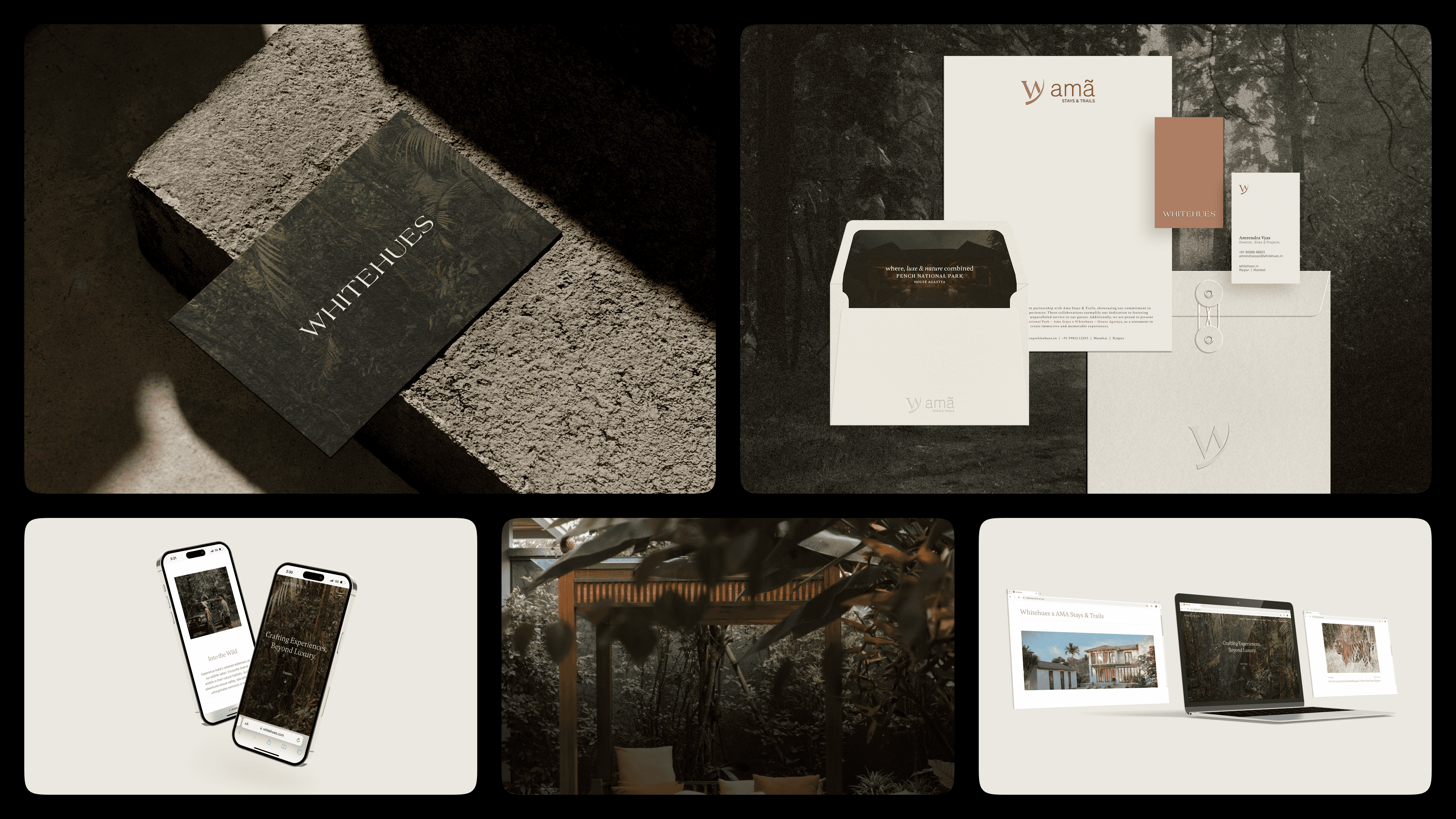
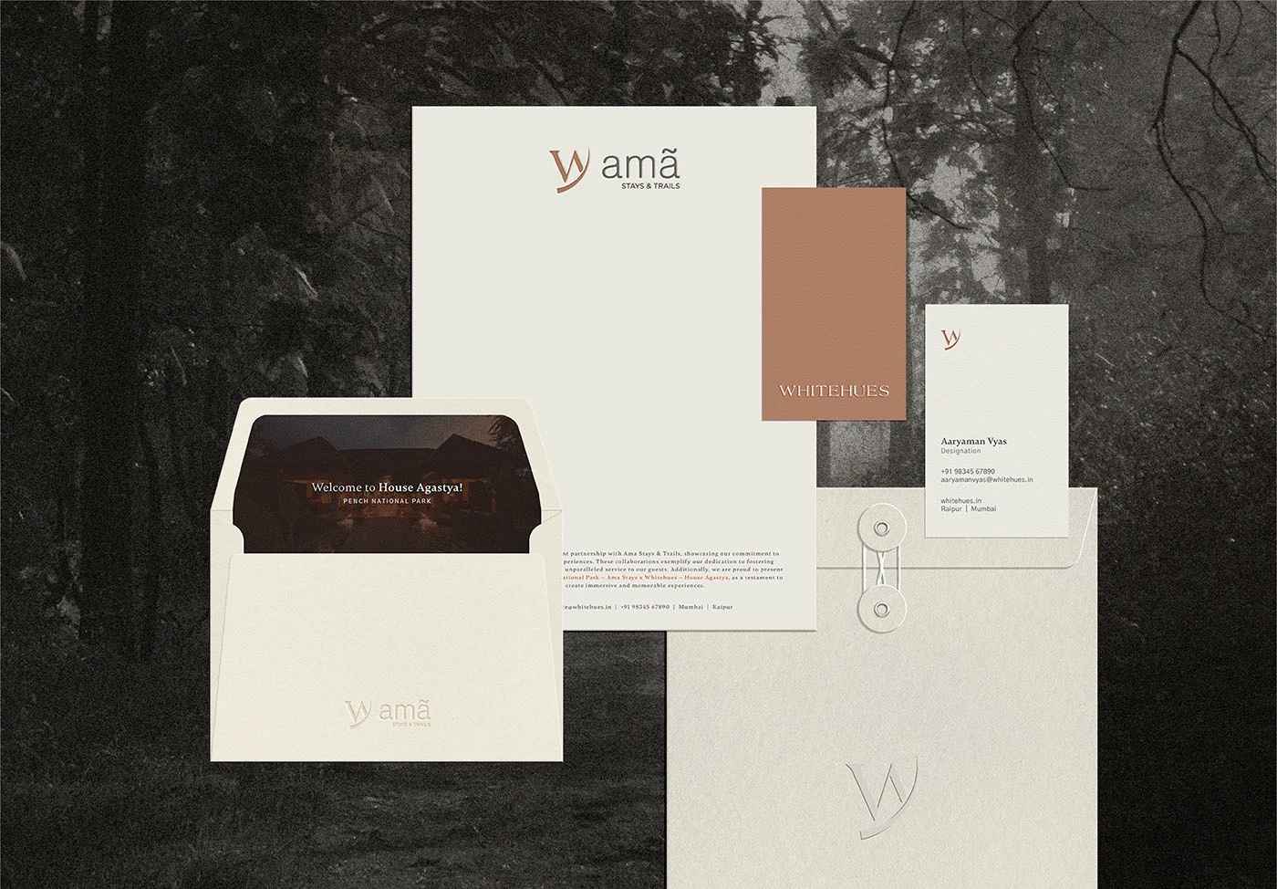
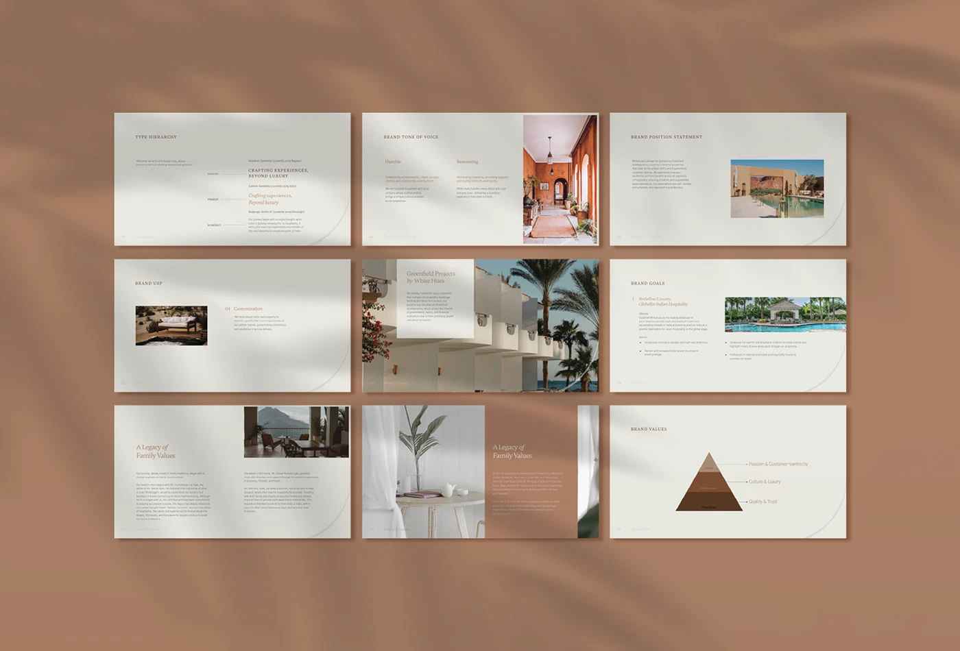
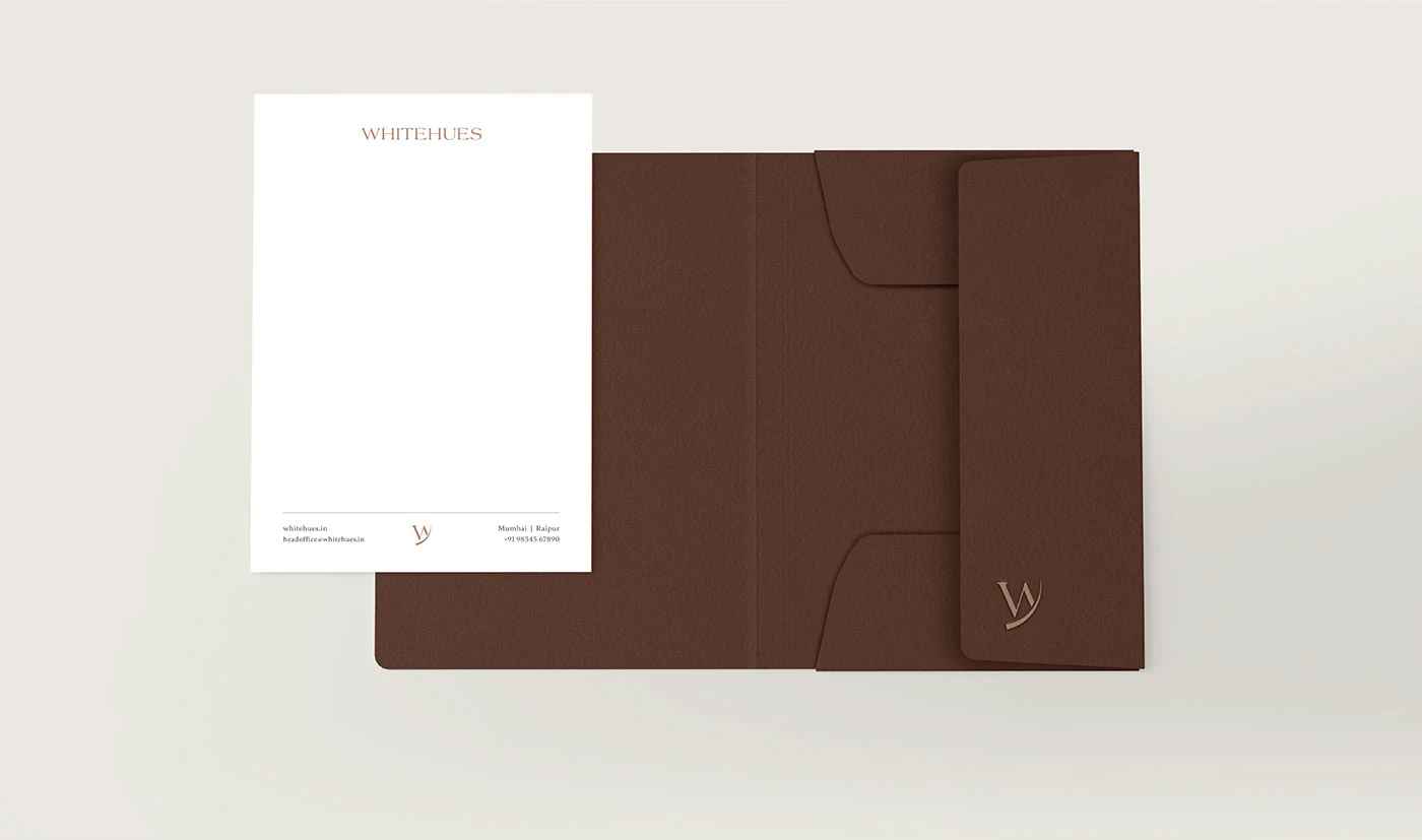
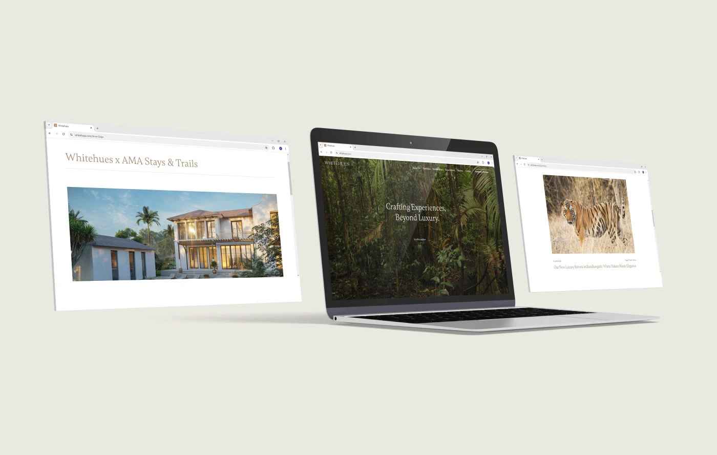
WhiteHues explores the infinite possibilities within a single color. This architecture and hospitality brand specializes in spaces where white isn't an absence but a presence—creating environments that feel both expansive and intimate. We developed a brand identity and website that demonstrates how constraint breeds creativity, showing that limitation to one color actually opens up a world of texture, light, and form.
STRATEGY
BRAND IDENTITY
WEBSITE DESIGN

CHALLENGE
Revealing complexity within monochromatic constraint.
The challenge was avoiding the obvious—stark minimalism—and instead revealing white's complexity. We needed to differentiate WhiteHues from countless other hospitality firms while staying true to their monochromatic philosophy. The brand had to communicate sophistication without feeling cold, purity without sterility. The website needed to showcase projects without becoming visually monotonous, proving that working within constraints can produce the most innovative results.
CREATIVE CONCEPT
White as spectrum, not absence.
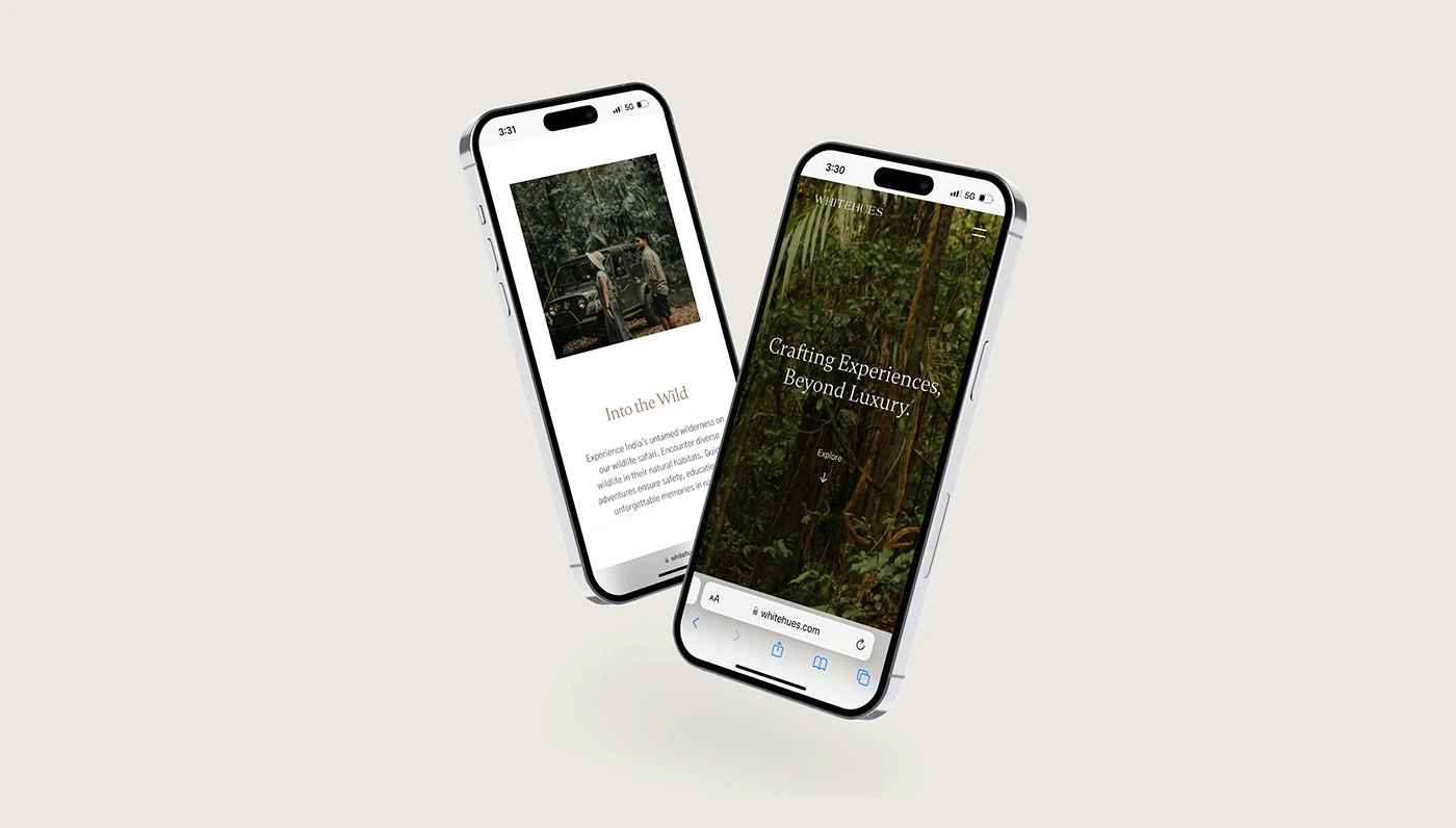
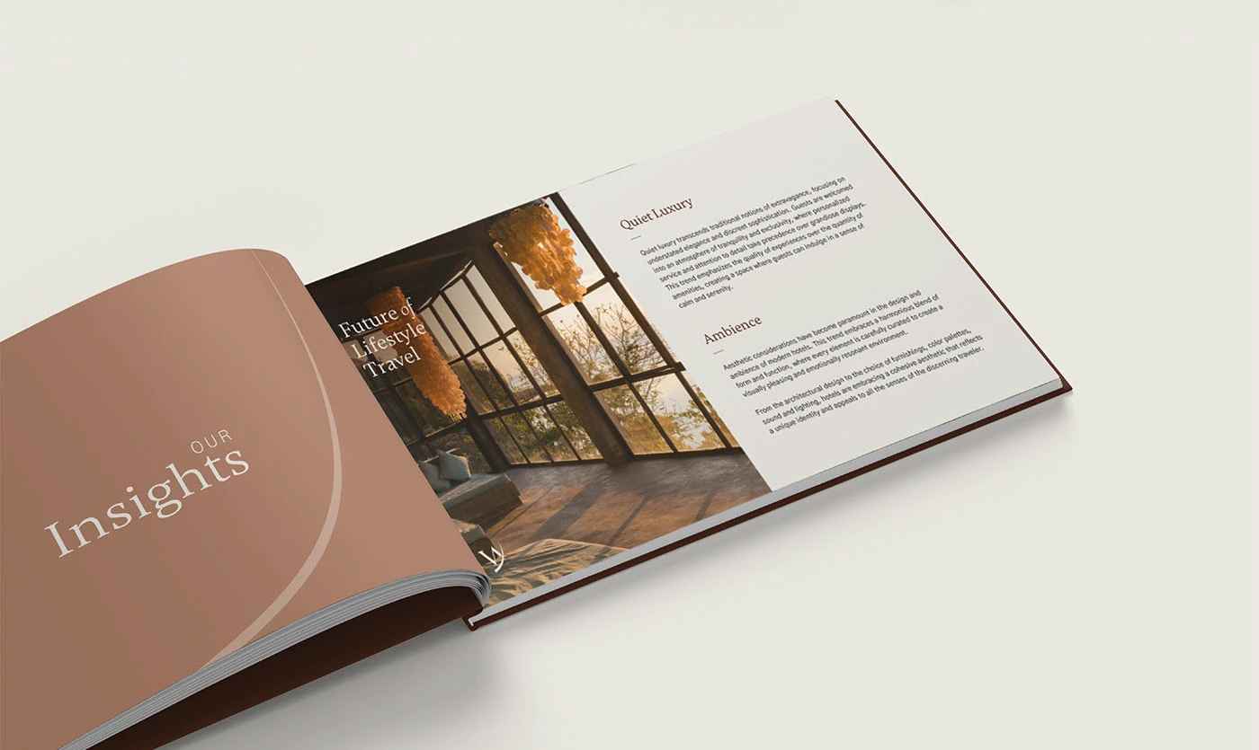
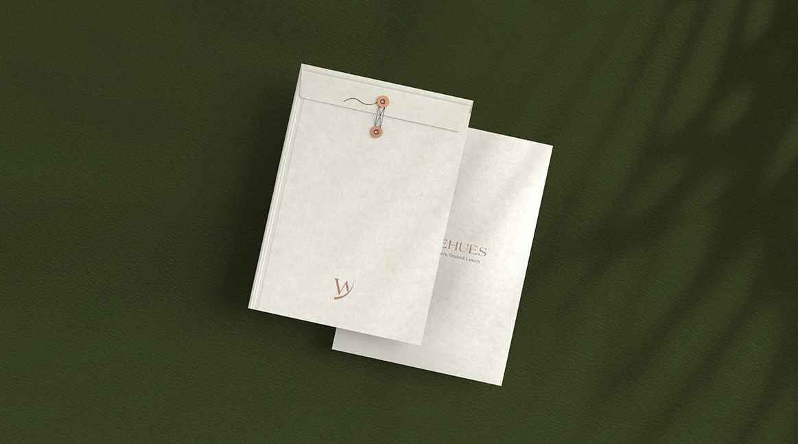
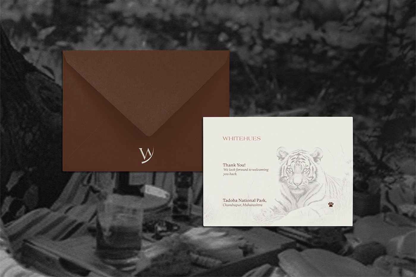
We treated white not as one color but as a spectrum—from warm ivory to cool alabaster, matte chalk to glossy pearl. The identity uses subtle tonal variations and shadow play to create depth without breaking the palette. Typography shifts weight rather than color for emphasis. The website becomes a study in light and shadow, where navigation happens through subtle elevation changes and micro-animations. Project photography focuses on texture and materiality—the grain of white oak, the sheen of marble, the softness of linen. We introduced a "white noise" pattern system that adds visual interest while maintaining purity. The result is a brand that proves limitation is liberation—showing that mastery of one thing is more powerful than mediocrity in many.
DETAILED CASE-STUDY
