UNITED KINGDOM
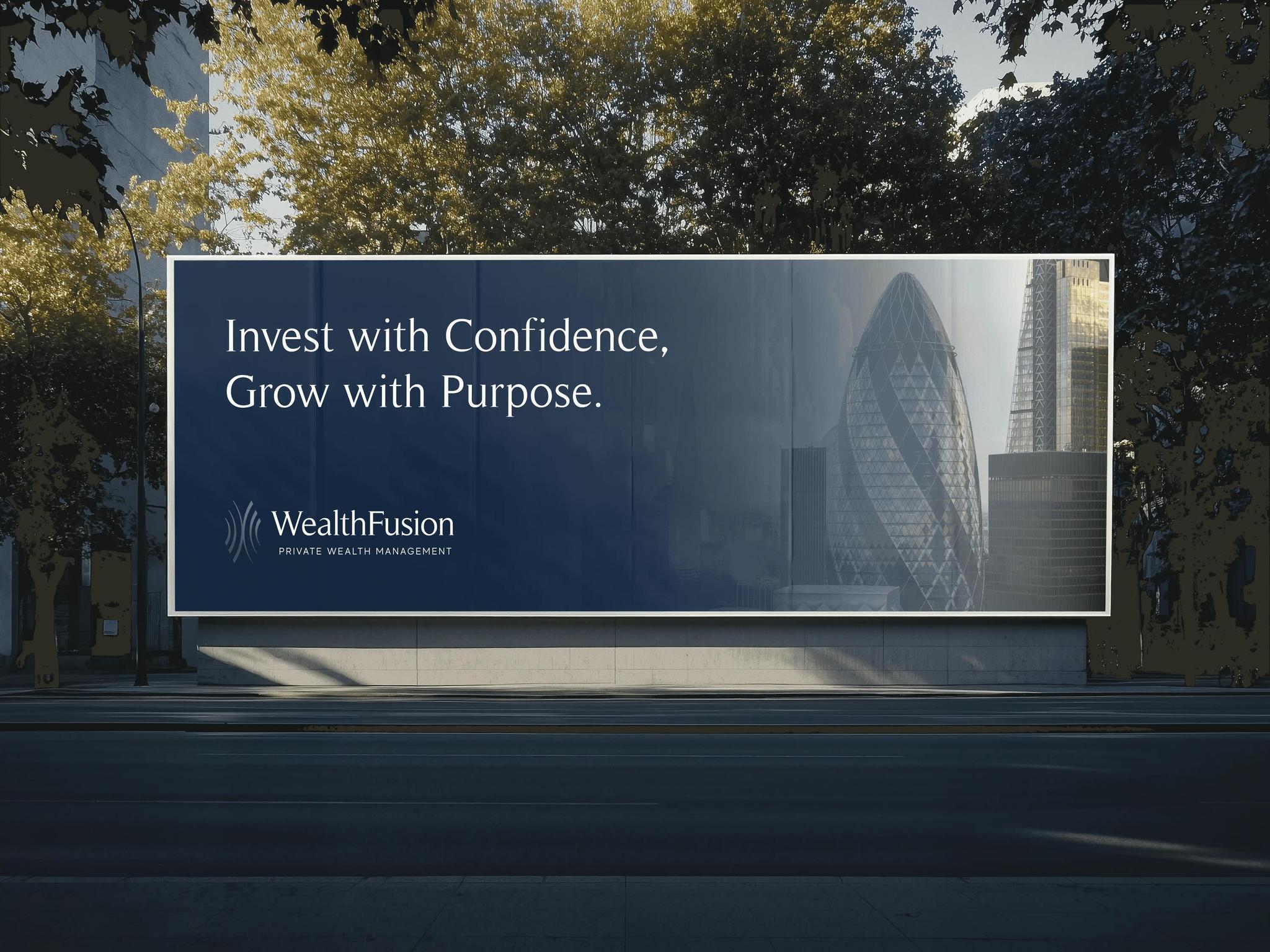
WealthFusion is a multi-family office serving high net worth individuals and institutional clients through bespoke discretionary and advisory investment solutions. An established firm with a strong track record, they came to us for a complete overhaul—brand identity, website, and strategy copy—to carry their authority into a new era without unsettling the trust they had spent years earning.

CHALLENGE
WealthFusion's clients—HNIs, family offices, institutional investors—chose the firm for its rigour and relationships, not its logo. Any rebrand risked signalling instability to exactly the people who value continuity most. Beyond the identity, we needed to overhaul the website and rewrite the strategy copy for a firm whose language had grown stale. Every word and every design decision had to communicate decisive modernity while holding the weight of an established reputation. The challenge wasn't reinvention—it was careful evolution, where nothing felt like it had been replaced, only sharpened.
CONCEPT
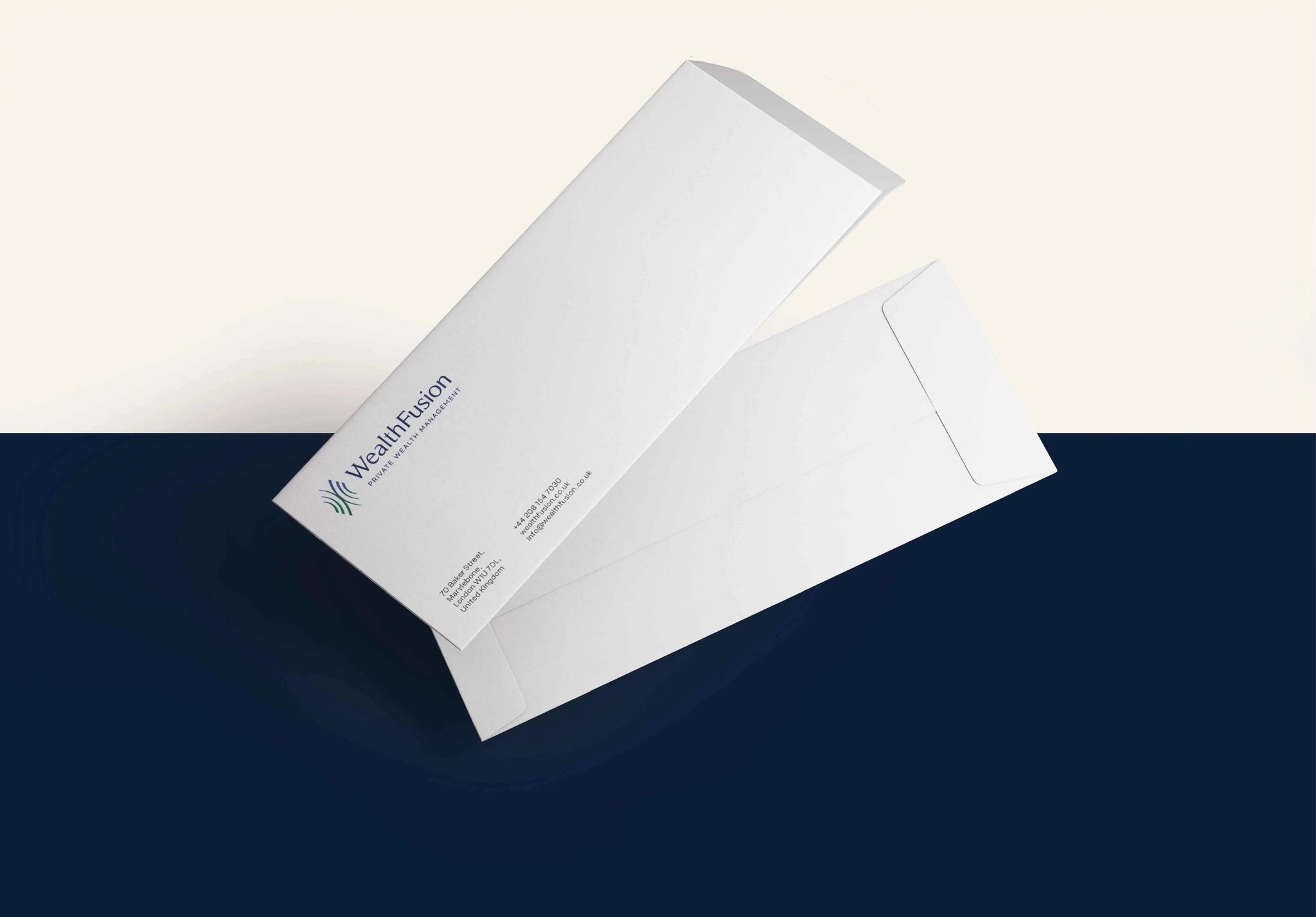
We rebuilt the identity, the website, and the voice of the firm simultaneously—so every element spoke the same language. The refreshed mark uses geometric precision suggesting the discipline of the investment philosophy: balanced, structured, nothing decorative. A palette anchored in depth rather than brightness—tones that read as permanent, not fashionable. The website is architectural: generous spacing, considered hierarchy, language that informs rather than persuades. Strategy copy was rewritten to reflect how WealthFusion actually thinks—direct, rigorous, never performative. The result is a brand that serious clients recognise as serious, without needing to be told.