Typcaste
India
Breaking design's status quo.
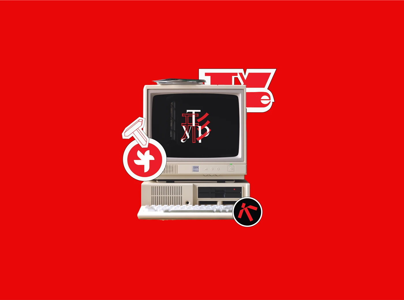
Typcaste is an independent brand design agency that refuses to play by Mumbai's established rules. Comprised of futurists, strategists, and designers, the studio believes in designing a better future rather than decorating the present. We developed a brand identity that reflects their rebellious spirit—challenging the hierarchies and conventions that often limit Indian design. The name itself is a provocative play on typography and India's complex social structures, signaling their intent to reshape not just brands but mindsets.
BRAND IDENTITY
MERCHANDISE DESIGN

CHALLENGE
Branding disruptors within the design industry.
How do you brand a design agency that wants to disrupt the very industry it operates in? The challenge was creating an identity that stands apart from Mumbai's saturated agency landscape while remaining credible to both traditional corporations and progressive startups. We needed to communicate radical thinking without appearing reckless, and showcase Indian creativity without exotic clichés. The brand had to attract clients ready for transformation while filtering out those seeking safe, predictable solutions. Most critically, we had to capture Typcaste's vision of design as a tool for social and cultural change, not just commercial success.

CREATIVE CONCEPT
Design insurgents who question before creating.
We positioned Typcaste as "design insurgents"—creators who question before they create. The visual identity deliberately breaks typographic conventions, with letterforms that shift between structured and fluid, suggesting transformation in progress. We chose a bold black and white foundation punctuated by unexpected color interventions, representing clarity of thought with bursts of possibility. The logo itself is never static—it adapts and evolves across applications, embodying their belief that brands should be living systems, not fixed marks. The website functions as a manifesto, with case studies presented as cultural provocations rather than portfolio pieces. Typography becomes activism, layouts become arguments, and every touchpoint challenges what Indian design can be. The result is a brand that attracts the brave—clients who see design not as decoration but as revolution.
DETAILED CASE-STUDY
