INDIA
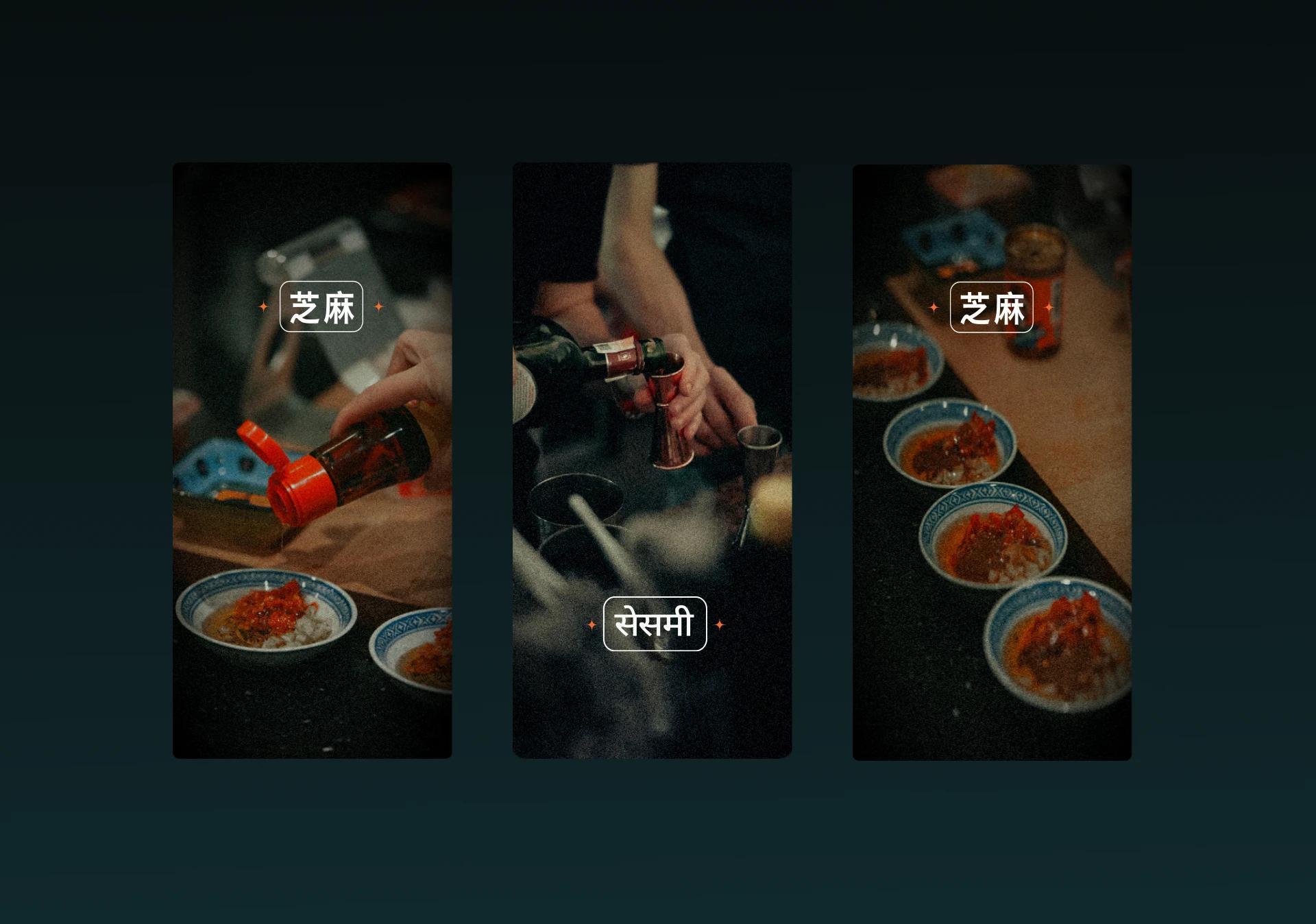
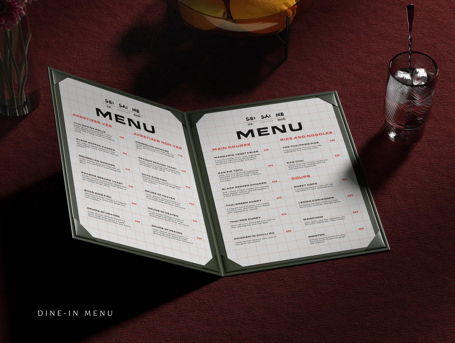
SE:SA:ME is a Pune delivery kitchen doing Pan-Asian food properly—Japanese, Chinese, and fusion, vegetarian and non-vegetarian, made with genuine attention to technique and flavour. We built the full brand from the ground up: identity, colour system, menu design, social media, stickers, tissue paper, and editorial print. Every touchpoint carries the same considered identity, from the app to the bag it arrives in.
CHALLENGE
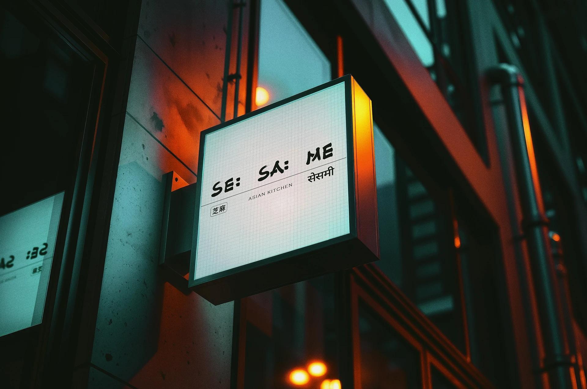
A delivery kitchen lives and dies by what arrives at the door—but the first impression is always the brand. SE:SA:ME needed an identity that communicated genuine culinary range and care before a single dish was tasted. In a market where Pan-Asian food is either treated as generic fast delivery or over-styled into fine dining, the brand needed to occupy the honest, confident middle—specific enough to signal quality, accessible enough to order from on a Tuesday night without a second thought.
CONCEPT
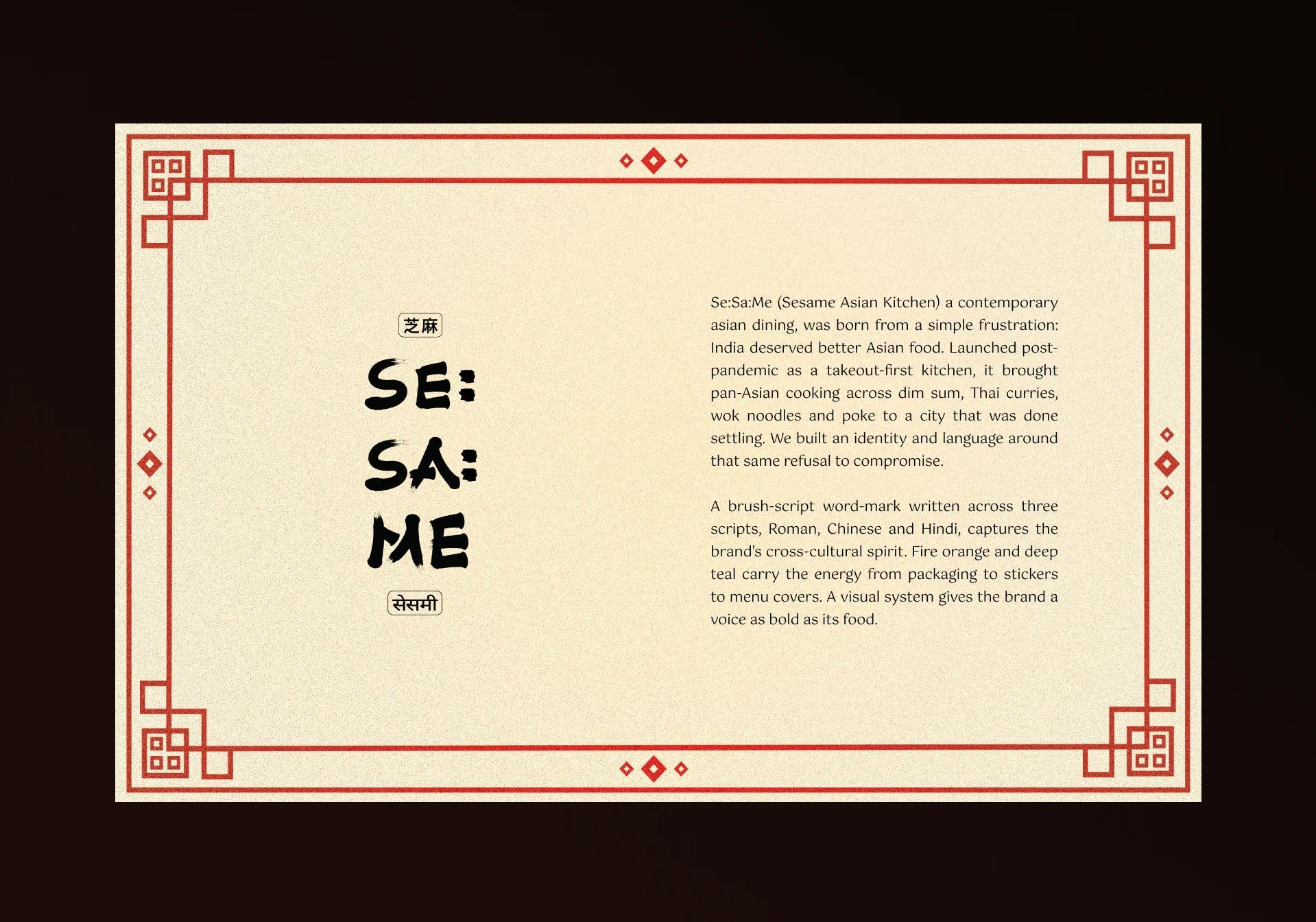
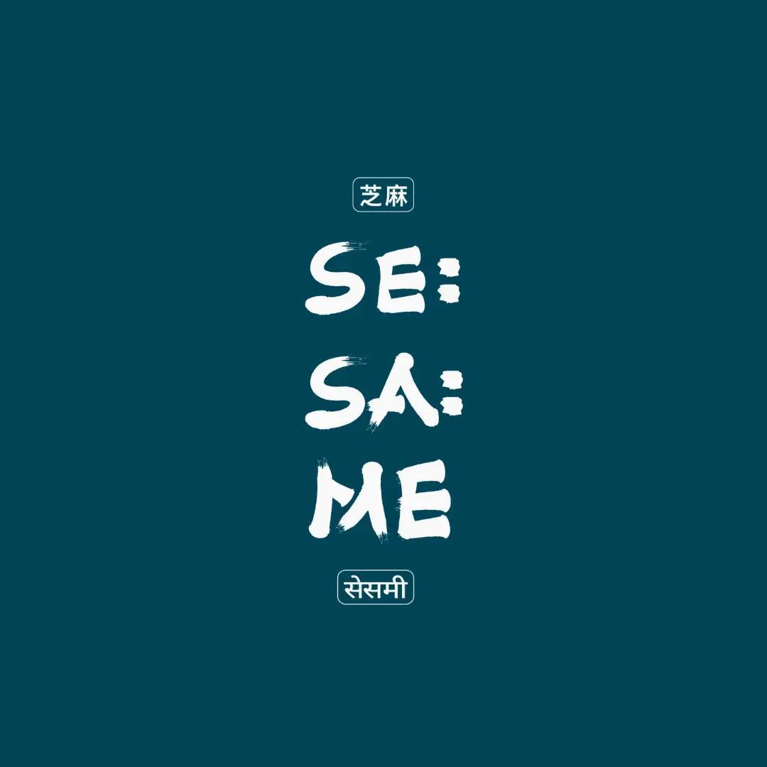
We built an identity that carries SE:SA:ME's personality from screen to doorstep—a visual system coherent across the logo, menu typography, social content, tissue paper, and stickers that accompany every delivery. Colour draws from Asian culinary tradition without quoting it literally: warm, bold, considered. The menu design gives equal weight to flavour description and visual clarity, making the act of ordering feel as good as the act of eating. Nothing is generic. The name itself—with its deliberate punctuation—signals a brand that thinks carefully about form. Every detail earns its presence, the way every ingredient in a good dish does.