INDIA
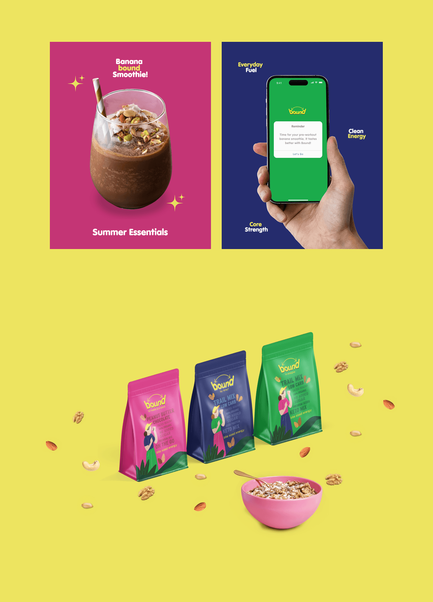
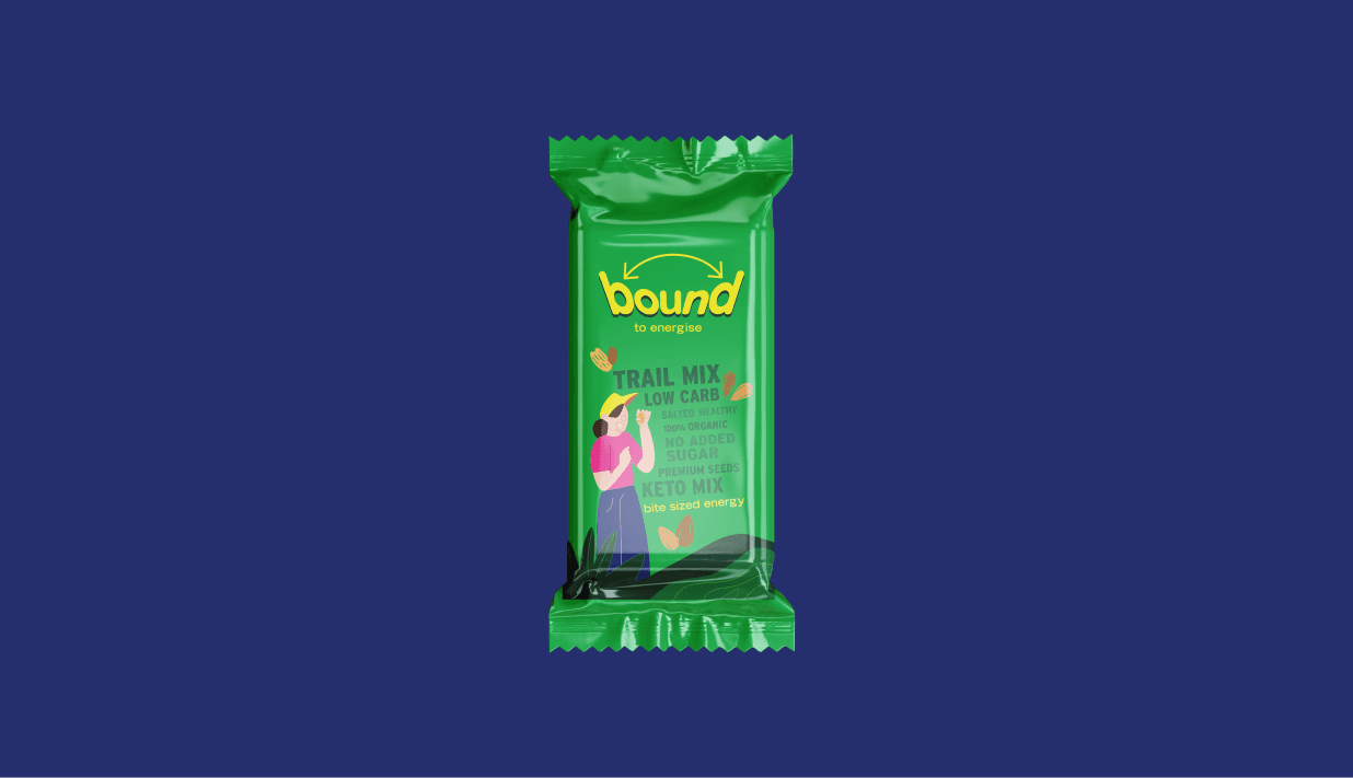
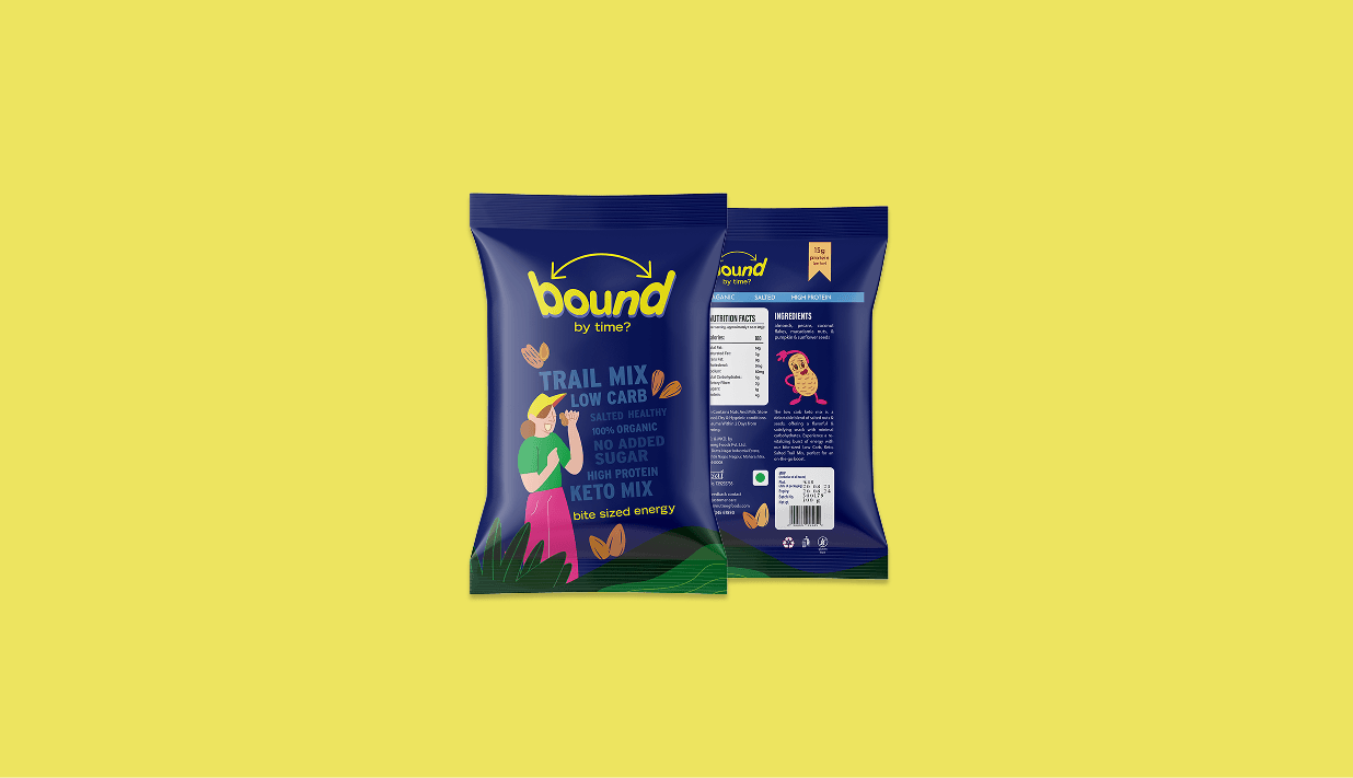
Bound is a clean-energy trail mix built for people who are always moving—organic nuts, no added sugar, high protein, the right salt. We named the brand, developed the strategy, created the identity, designed the packaging, and built the e-commerce website. Bite-sized, honest, and built entirely around the energy of the person who reaches for it.
CHALLENGE
The healthy snack category is crowded with good intentions and forgettable identities—brands that lead with nutrition claims and land nowhere memorable. Bound needed a name that did real work simultaneously: activating the product's energy proposition, the compact portable format, and the relentless pace of its target audience. The packaging had to earn attention through design confidence before a single claim was read. And the e-commerce experience needed to convert first-time visitors on the strength of what they saw—a brand strong enough to stand without explanation.
CONCEPT
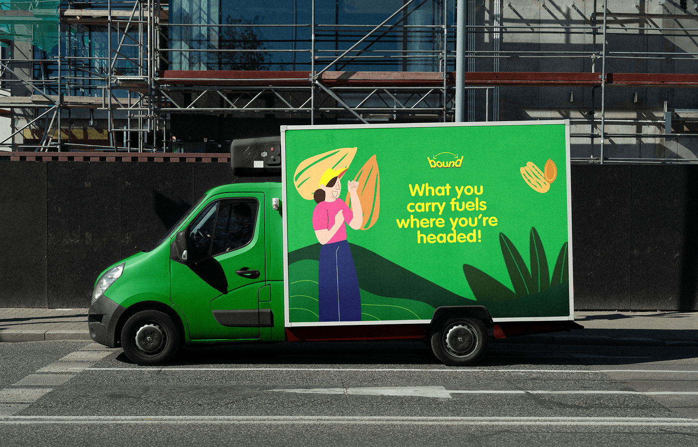
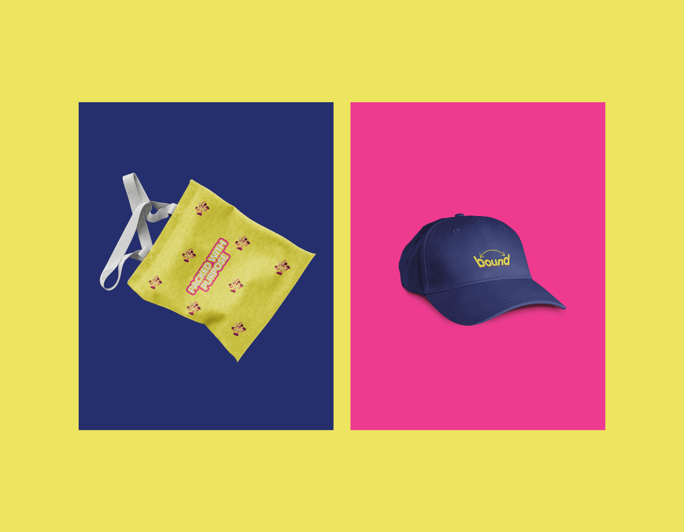
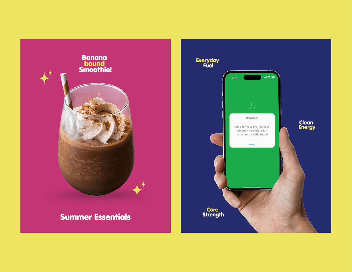
Three caricature illustrations—distinct characters in motion, each an expression of the person who reaches for Bound—anchor an identity built on energy and personality rather than health credentials. The name activates across the brand as both promise and wordplay: bound by time, bound to move, bound to win. Packaging is compact and confident, designed for pockets and gym bags as much as for shelves. The e-commerce experience carries the same directness—visual, fast, no sugar-coating. The copy speaks like the product tastes: clean, honest, and exactly enough.