NETHERLANDS
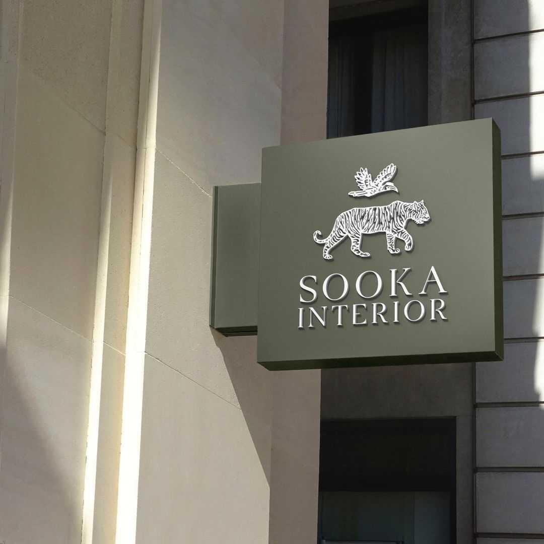
Sooka Interior is a Netherlands-based sustainable luxury homeware brand creating objects from materials that give back as much as they take—bamboo lights from fast-growing resources, bronze sculptures cast from upcycled pipelines, pieces where ecological intention and refined form are inseparable. We developed a brand identity that gives this philosophy a visual language as distinctive as the objects themselves.
CHALLENGE
The challenge was building a luxury identity for a brand whose core materials—bamboo, reclaimed bronze, natural fibres—are typically associated with ethical but understated aesthetics. Sooka's objects are genuinely beautiful and genuinely sustainable, but the market rarely expects both from the same brand. We needed to create a visual system that led with the quality of the work, not the virtue of the process—making the ecological story something a customer discovers and appreciates, rather than something they have to be persuaded by first.
CONCEPT
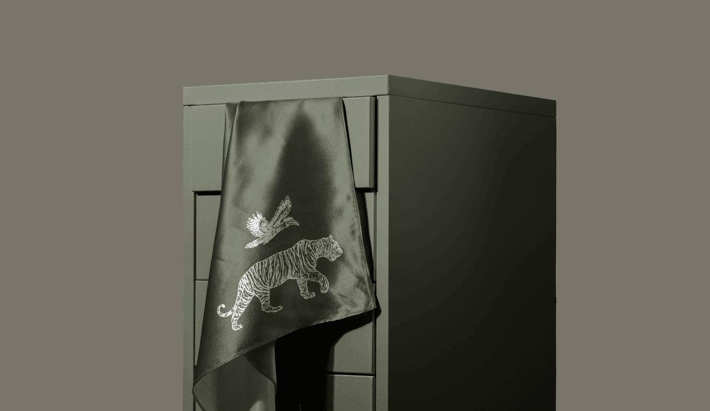
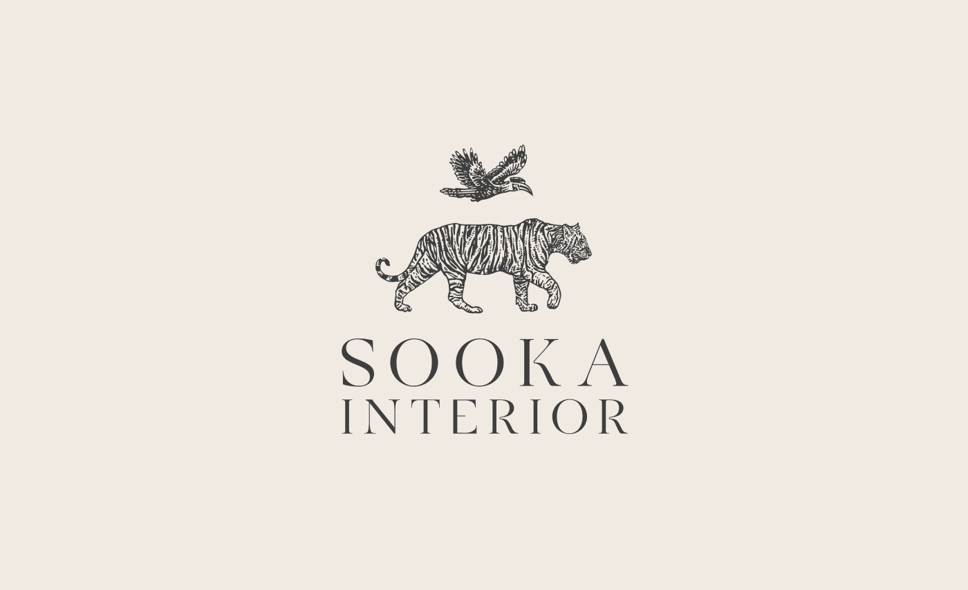
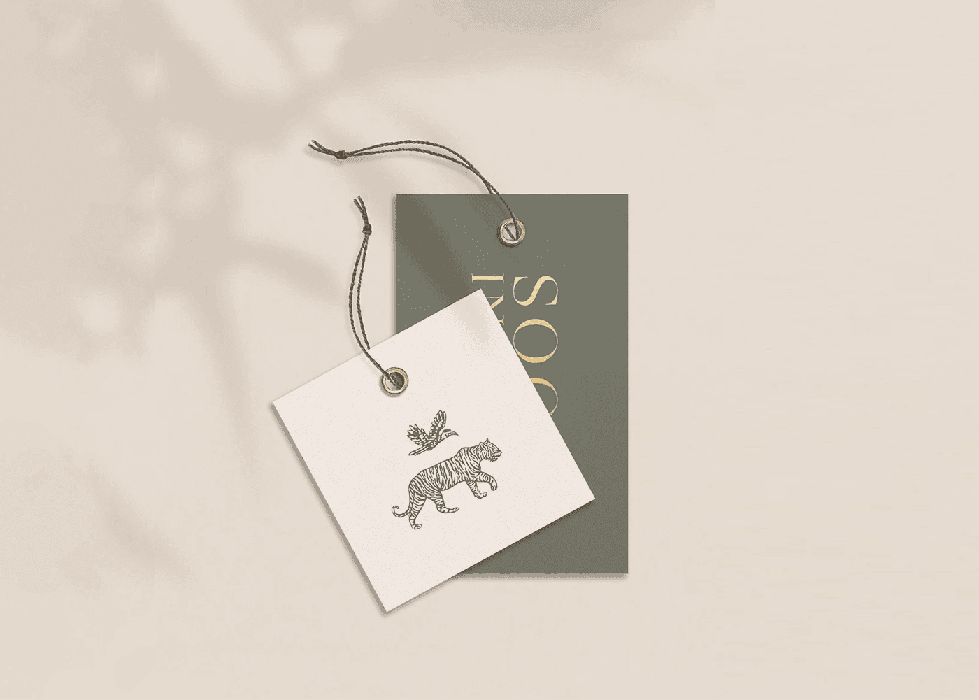
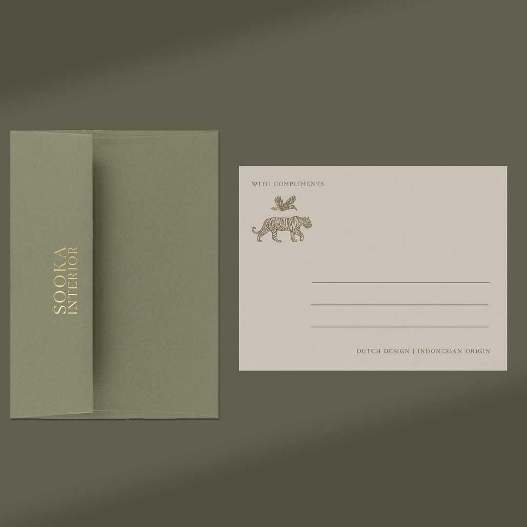
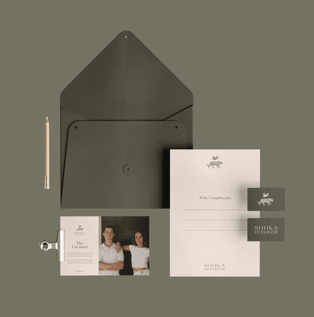
We built the identity around the idea that constraint produces character. The visual system draws directly from Sooka's materials and motifs—a custom illustration style featuring the animal forms and natural references woven through the brand's tribal and contemporary collections. Warm, earthy tones anchor the palette: not greens and recycling symbols, but the colours of bamboo, aged bronze, and hand-worked natural fibre. The wordmark carries the same quiet confidence as the objects—nothing decorative, everything deliberate. The result is a brand that wears its ecological conviction through beauty rather than announcing it through messaging.